Introduction
Landing pages are the digital storefronts where potential customers first engage with your business online. They hold immense power in capturing visitors’ interest and converting it into tangible business outcomes. However, crafting an effective landing page is not just about aesthetics or content; it requires a strategic understanding of what resonates with your audience and what doesn’t.
In this world of digital marketing, where every click can lead to a potential sale, it’s crucial to optimize your landing page. But often, businesses fall into common traps that can significantly dampen their landing pages’ effectiveness. These mistakes can range from overwhelming forms and inadequate information capture to ineffective offers and security concerns.
Through this blog, we’ll delve into these common pitfalls, providing insights and practical advice on how to avoid them. With real-world examples and expert tips, we aim to guide you in transforming your landing pages into powerful tools for customer engagement and landing page conversion.
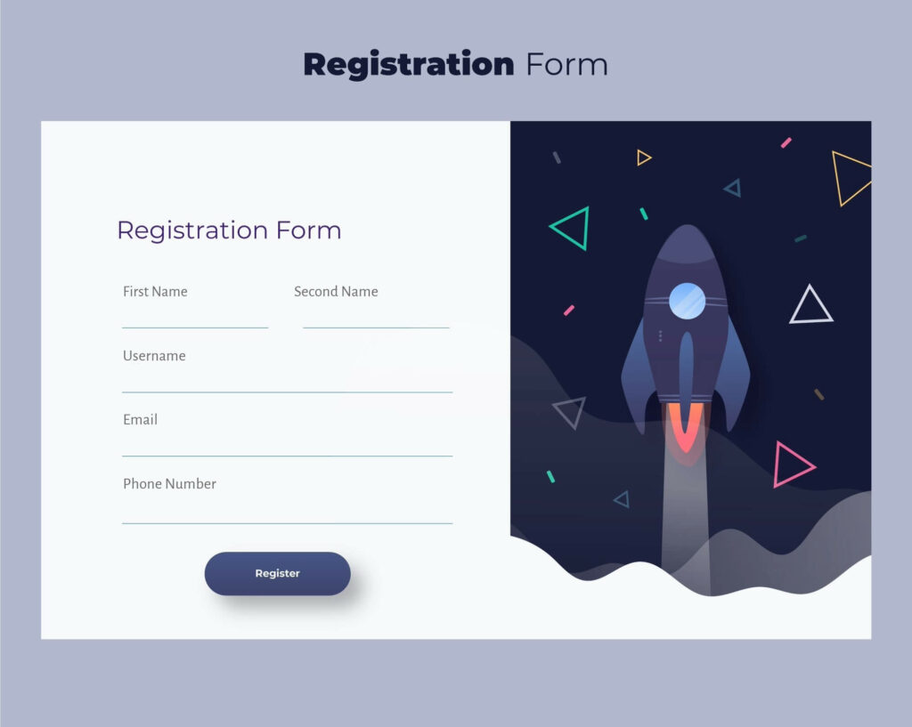
Here’s an example of what we aim for: a clean, minimalistic landing page that immediately engages the visitor without overwhelming them. The simplicity in design and clarity in message are key to its effectiveness.
Let me know if this introduction aligns with your vision, and if you’re ready, we’ll move on to expanding the next section.
Mistake #1: Inadequate Information Capture
A common mistake in designing landing pages is not capturing visitor information effectively. This section of the blog will explore the nuances of information capture and how to avoid common pitfalls in landing page structure.
Name Collection Issues:
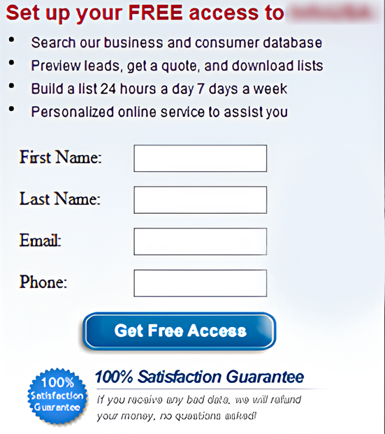
When it comes to collecting names on a landing page, a one-size-fits-all approach can lead to confusion. For instance, if you only ask for a ‘name’, you might end up with a mix of first names, full names, and even nicknames. This inconsistency can create challenges, especially in personalized marketing efforts. A more effective approach is to separate the fields for the first and last names. This not only ensures consistency in your database but also allows for more personalized communication with your audience.
Email Address Collection:
Email addresses are gold in the digital marketing world. However, some businesses hesitate to ask for them on their landing pages, fearing that they’ll receive fake addresses or because they undervalue email marketing. Remember, email is a standard communication method, and its effectiveness in marketing is well-documented. To mitigate the issue of fake emails, consider enhancing the value of your offer or using email verification methods.
Phone Number Collection:
Adding a phone number field to your form on a landing page, marked as optional, can be surprisingly effective. It rarely discourages people from completing the form and can provide valuable contact information. Personal outreach, like a phone call, in today’s automated world can significantly enhance customer relations. However, be mindful that some people might provide fake numbers, but that’s a small price for the value genuine contacts bring.
Differentiating Phone Types:
If you’re planning on text message marketing, make sure to differentiate between mobile and landline numbers on your landing page. This distinction is vital as more people shift towards mobile phones, especially among younger demographics. By explicitly asking for a mobile number, you ensure that your text marketing reaches the intended device.
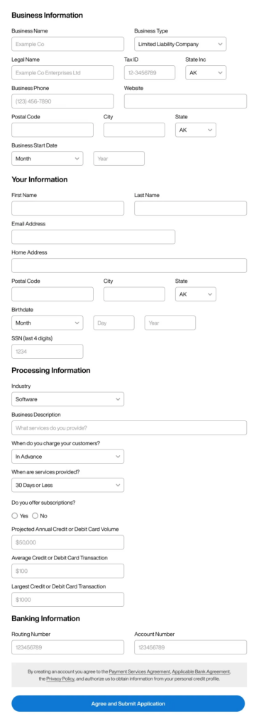
Overloading Forms:
Avoid the temptation to cram too many questions into one screen on your landing page. Long forms can be off-putting and may lead to lower completion rates. If you believe a longer form is necessary, validate your assumption through split testing. Let data guide your decision on the optimal length and complexity of your forms.
Mistake #2: Overwhelming Forms
Another key mistake to avoid in landing page design is overwhelming visitors with complex and lengthy forms. This part of the blog will delve into how to strike the right balance in form design on a landing page.
Form Length and Complexity:
The length and complexity of your forms can significantly impact conversion rates on a landing page. Long forms can be intimidating and may deter visitors from completing them, leading to a loss in potential leads. It’s crucial to ask only for the most essential information that aligns with your marketing goals. If you feel a longer form is necessary, validate this with split testing to see if the additional information justifies the potential drop-in completion rates.
Number of Fields per Screen:
The number of questions or fields presented at once should be carefully considered on your landing page. Too many fields on one screen can overwhelm visitors and lead to form abandonment. Break down the form into smaller, more manageable parts if necessary. This not only makes the form appear less daunting but also helps in maintaining the visitor’s attention and interest throughout the process.
Balancing Information Collection with User Experience:
While it’s important to collect as much relevant information as possible, this should never come at the cost of user experience on a landing page. Forms should be designed with the user in mind, ensuring they are intuitive, easy to fill out, and not overly time-consuming. This user-centric approach will not only improve form completion rates but also enhance the overall perception of your brand.
Visual Design and Placement:
The visual design and placement of the form on the landing page also play a crucial role. The form should be prominently displayed but not dominate the page. It should blend seamlessly with the overall design of the landing page, encouraging rather than forcing engagement.
Mistake #3: Ineffective Offers and Call-to-Actions
The effectiveness of a landing page is often judged by its ability to convert visitors into leads or customers. A critical aspect of this conversion process is the offer and the call-to-action (CTA) presented on the page. This section will explore common errors made in this area and how to avoid them.
Low-Value Offers:
One of the biggest mistakes is providing offers that don’t hold significant value for the visitor on a landing page. An offer like “Sign up for our newsletter” or “Learn more” often fails to entice because it doesn’t provide immediate, tangible benefits. Instead, focus on offers that promise value, such as free trials, discounts, e-books, or exclusive content. These kinds of offers are more likely to be perceived as a fair trade for the visitor’s contact information.
Lack of Personalized Incentives:
Another mistake is not tailoring offers to the specific needs and interests of your target audience on your landing page. Generic offers are less likely to resonate with visitors. Use the data you have about your audience to create more personalized and relevant offers. For instance, if your target audience is primarily interested in web development, an offer for a free web development tool or resource guide would be more effective than a general tech newsletter.
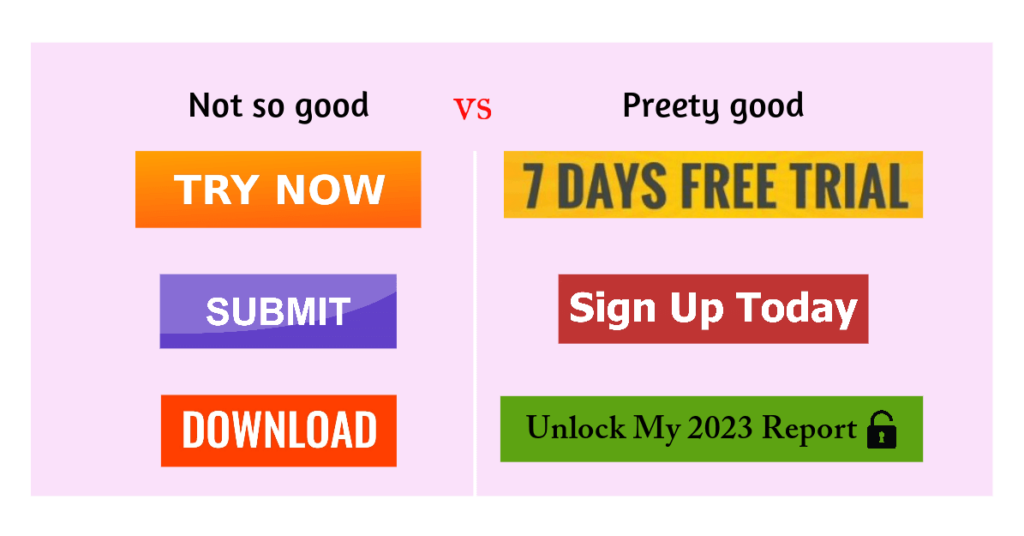
Call-to-Action Optimization:
The call-to-action is your final push to get the visitor to take the desired action on your landing page. Common mistakes here include vague CTAs like “Click here” or overly aggressive ones like “Buy now!” Instead, use clear, action-oriented language that aligns with the offer. Phrases like “Get Your Free Guide Now” or “Start Your Free Trial Today” are specific and create a sense of urgency and value.
Testing and Refinement:
Always be prepared to test different offers and CTAs to see which combinations work best on your landing page. A/B testing can be incredibly valuable in determining the most effective strategies for your specific audience and goals.
Mistake #4: Misuse of the Word ‘Free’
The use of the word ‘free’ in offers and CTAs on landing pages can be a double-edged sword. This section of the blog will discuss how to effectively use ‘free’ offers without attracting the wrong audience or devaluing your product or service.
Attracting the Wrong Audience
Offering something for free can significantly increase interest on a landing page, but it can also attract ‘freebie seekers’ who are not genuinely interested in your product or service. For instance, a business that offers a free physical product, including shipping, might see a high initial conversion rate. However, these customers may not convert into paying customers later, which ultimately affects the bottom line.
Balancing Free Offers
It’s important to balance the appeal of free offers with the goal of attracting quality leads on your landing page. Instead of giving away products or services entirely for free, consider offering a discount, a free trial with limited features, or an informational product like a report or e-book. This approach can still leverage the attractiveness of ‘free’ while filtering out those only interested in freebies.
Context and Intentions
The context in which you present a free offer is crucial on a landing page. Understand the user context, setting, and intentions of the traffic you’re directing to the offer. Tailor your free offers to match the expectations and needs of your target audience, ensuring they align with your overall marketing strategy and business goals.
Example
Imagine a landing page offering a free trial of a software product. Instead of giving away the full product for free, the trial could include basic features, enticing users to upgrade to the full version for more advanced features. This strategy attracts users who are genuinely interested in the product’s capabilities.
Mistake #5: Security Concerns
When creating landing pages, particularly those that involve the collection of personal information, overlooking security aspects can be a critical mistake. In this section, we’ll cover the importance of ensuring security on your landing pages and how to effectively communicate this to your visitors.
Importance of Secure Pages
In an era where data breaches are increasingly common, ensuring the security of personal information is paramount. Whenever you’re asking for sensitive data like email addresses, phone numbers, or, especially, payment information, it’s essential to use secure web pages. This means having an SSL certificate, indicated by ‘https’ in your web address, and possibly additional security measures depending on the nature of the data being collected.
Building Trust with Visitors
Using secure pages is not just about protecting data; it’s also about building trust with your visitors. Internet users are becoming more aware of online security issues and are more likely to trust and engage with websites that clearly prioritize their privacy and security. Make sure your landing page clearly indicates that it’s secure, usually through a visual indicator like a padlock icon in the address bar.
Avoiding Security Warnings
Insecure pages not only deter visitors but can also lead to security warnings from browsers, which can significantly impact your website’s credibility and visitor trust. Ensuring your landing page is secure prevents these warnings and maintains a professional, trustworthy online presence.
Communicating Security Measures
Don’t hesitate to communicate the security measures you have in place. A brief mention or a visual symbol indicating that the user’s data will be securely handled can go a long way in increasing conversions. This reassurance can be the deciding factor for a visitor contemplating whether or not to share their personal information.
Mistake #6: Underestimating Visitor Willingness to Share Information
The final common mistake in landing page design is underestimating how much information visitors are willing to provide. This section will explore the balance between asking for information and respecting visitor comfort.
Testing Different Form Types
Businesses often err on the side of caution by asking for minimal information, assuming visitors are reluctant to share more. However, this assumption can lead to missed opportunities for gathering valuable customer insights. It’s important to test different types of forms – short, long, multi-step, etc. – to see which yields the best combination of completion rate and information depth.
Aligning Offers with Visitor Desires
The key to encouraging visitors to share more information is aligning your offers closely with their desires. The more relevant and valuable the offer, the more likely visitors are to provide detailed information. For instance, a comprehensive e-book on a topic of interest might motivate visitors to share not just their email address but also information about their specific challenges or interests.
Gradual Information Gathering
Consider a gradual approach to information gathering. Start with basic information and, as the relationship develops, ask for more detailed data. This can be done through subsequent interactions, like follow-up emails or personalized offers based on initial information provided.
Conclusion: Navigating the Landscape of Effective Landing Pages
As we’ve explored throughout this blog, crafting an effective landing page is a nuanced art that requires a keen understanding of both your audience and the principles of digital marketing. Avoiding common mistakes can significantly enhance the effectiveness of your landing pages, turning them into powerful tools for customer engagement and landing page conversion. Here’s a recap of the key takeaways:
- Optimize Landing Page Information Capture: Ensure that your forms are user-friendly, asking for information in a way that respects user privacy and encourages completion.
- Balance Form Length and Complexity: Keep your forms concise yet informative and consider multi-step formats to make information gathering more manageable for users.
- Create Compelling and Relevant Offers: Offers should be enticing and valuable to your audience, with clear, action-oriented CTAs.
- Use ‘Free’ Wisely: Attract quality leads with offers that balance the appeal of ‘free’ with genuine value.
- Prioritize Security: Build trust by using secure pages, especially when collecting sensitive information.
- Don’t Underestimate Willingness to Share Information: Test different form types and align offers with visitor interests to maximize information sharing.
Remember, the goal is to make every visitor’s click count. By avoiding these common mistakes, you can create landing pages that not only captivate your audience but also drive meaningful conversions. Regularly testing and refining your approach based on data and feedback will keep your strategies fresh and effective.
Landing pages are more than just a gateway to your website; they are a reflection of your brand’s promise and value. By optimizing these vital touchpoints, you ensure that every first impression is impactful, setting the stage for a lasting and fruitful relationship with your customers.
Transform your landing pages into conversion powerhouses with our expert guidance. Avoid common pitfalls and elevate your digital marketing strategy.
Contact Us Now for personalized advice and tailored solutions.
Let’s make every click count together!